Pie Chart


Pie Chart
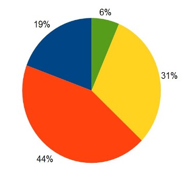
Pie Chart: Pie chart is a way of representing simple data for easy understanding. A pie chart consists of sectors of a circle. The size of each sector is directly perportional to the component part or information it represents.
Central angle for a component = (FREQUENCY/TOTAL FREQUENCY) 360
PIE CHART Construction:
Example: There are 216 workers in a factory as per list given below:
| Cadre | Labourer | Mechanic | Fitter | Supervisor | Clerk |
|---|---|---|---|---|---|
No. of Workers | 75 | 60 | 36 | 27 | 18 |
Represent the above data by a pie chart.Solution:Total number of workers = 216.
Calculation of Central Angles
| Cadre | No. of Workers | Central Angle |
|---|---|---|
Labourer | 75 | (75/216 × 360)° = 125° |
Mechanic | 60 | (60/216 × 360)° = 100° |
Fitter | 36 | (36/216 × 360)° = 60° |
Supervisor | 27 | (27/216 × 360)° = 45° |
Clerk | 18 | (18/216 × 360)° = 30° |
EXAMPLE:

Thus, we obtain the required pie chart, as shown in the given figure.
The pie chart shows four different modes of transport to school for a group of students. Calculate the percentage of students who go to school by car.
| |||
| Right Option : A | |||
| View Explanation | |||
The table shows the number of cups of four different beverage sold by a coffee shop in a certain day. The angle of sector in a pie chart representing hot chocolate is:
| |||||||||||||
| Right Option : B | |||||||||||||
| View Explanation | |||||||||||||
The table shows the number of three differenct brands of laptops sold by a certain store. The data are respresented by the pie chart which shows a semicircle divided into six equal sectors. The angle of sector representing the number of Bell laptops sold is :
| |||||||||||
| Right Option : B | |||||||||||
| View Explanation | |||||||||||
Students / Parents Reviews [20]
It was a good experience with Abhyas Academy. I even faced problems in starting but slowly and steadily overcomed. Especially reasoning classes helped me a lot.

Cheshta
10thAbhyas is an institute of high repute. Yogansh has taken admission last year. It creates abilities in child to prepare for competitive exams. Students are motivated by living prizes on basis of performance in Abhyas exams. He is satisfied with institute.

Yogansh Nyasi
7thAbhyas Methodology is very good. It is based on according to student and each child manages accordingly to its properly. Methodology has improved the abilities of students to shine them in future.

Manish Kumar
10thAbhyas institute is one of the best coaching institute in the vicinity of Ambala Cantt area. The teachers of the institute are well experienced and very helpful in solving the problems of the students.The good thing of the institute is that it is providing extra classes for the students who are w...

Aman Kumar Shrivastava
10thAbhyas is a complete education Institute. Here extreme care is taken by teacher with the help of regular exam. Extra classes also conducted by the institute, if the student is weak.

Om Umang
10thUsually we see institutes offering objective based learning which usually causes a lag behind in subjective examinations which is the pattern followed by schools. I think it is really a work of planning to make us students grab the advantages of modes of examination, Objective Subjective and Onli...

Anika Saxena
8thIt was good as the experience because as we had come here we had been improved in a such envirnment created here.Extra is taught which is beneficial for future.

Eshan Arora
8thWe started with lot of hope that Abhyas will help in better understnding of complex topics of highers classes. we are not disappointed with the progress our child has made after attending Abhyas. Though need to mention that we expected a lot more. On a scale of 1-10, we would give may be 7.

Manya
8thA marvelous experience with Abhyas. I am glad to share that my ward has achieved more than enough at the Ambala ABHYAS centre. Years have passed on and more and more he has gained. May the centre flourish and develop day by day by the grace of God.

Archit Segal
7thMy experience with Abhyas academy is very nice or it can be said wonderful. I have been studying here from seven class. I have been completing my journey of three years. I am tinking that I should join Abhyas Academy in tenth class as I am seeing much improvement in Maths and English

Hridey Preet
9thMy experience with Abhyas is very good. I have learnt many things here like vedic maths and reasoning also. Teachers here first take our doubts and then there are assignments to verify our weak points.

Shivam Rana
7thI have spent a wonderful time in Abhyas academy. It has made my reasoning more apt, English more stronger and Maths an interesting subject for me. It has given me a habbit of self studying

Yatharthi Sharma
10thMy experience with Abhyas Academy has been very good. When I was not in Abhyas whenever teacher ask questions I could not speak it confidently but when I came in Abhyas, my speaking skills developed and now I am the first one to give the answer of teachers question.

Upmanyu Sharma
7thAbhyas institute is one of the best coaching institute in the vicinity of Ambala cantt.The institute provides good and quality education to the students.The teachers are well experienced and are very helpful in solving the problems. The major advantages of the institute is extra classes for weak...

Shreya Shrivastava
8thOne of the best institutes to develope a child interest in studies.Provides SST and English knowledge also unlike other institutes. Teachers are co operative and friendly online tests andPPT develope practical knowledge also.

Aman Kumar Shrivastava
10thMy experience with Abhyas academy is very good. I did not think that my every subject coming here will be so strong. The main thing is that the online tests had made me learn here more things.

Hiya Gupta
8thWhen I have not joined Abhyas Academy, my skills of solving maths problems were not clear. But, after joining it, my skills have been developed and my concepts of science and SST are very well. I also came to know about other subjects such as vedic maths and reasoning.

Sharandeep Singh
7thThe experience was nice. I studied here for three years and saw a tremendous change in myself. I started liking subjects like English and SST which earlier I ran from. Extra knowledge gave me confidence to overcome competitive exams. One of the best institutes for secondary education.

Aman Kumar Shrivastava
10thIn terms of methodology I want to say that institute provides expert guidence and results oriented monitering supplements by requsite study material along with regular tests which help the students to improve their education skills.The techniques of providing education helps the students to asses...

Aman Kumar Shrivastava
10thAbhyas academy is great place to learn. I have learnt a lot here they have finished my fear of not answering.It has created a habit of self studying in me.The teachers here are very supportive and helpful. Earlier my maths and science was good but now it has been much better than before.